
Case Study: Sun Sign
Sun Sign is a fictional astrology app made to display my graphic design capabilities, as well as take a first step into UI/UX design. Below I will walk through my design process. The prototype includes welcome, login, and sign up screens, as well as a dashboard. View the Figma prototype here.
I. Problems Identified
Since it was my first time doing UI/UX design, I wanted to take something close to me and solve the things that tended to annoy me. I like astrology and find it fun, so I decided to look into making an app to view your daily horoscope. I used the app Chani as a base since it’s the one I tend to use. The problems identified were:
1. No “Yesterday’s Horoscope” – There is no option to go back a day. It’s very easy to forget to check your horoscope. While it’s fun, it’s definitely not the most important part of a daily routine. Being able to go back and see the day that you missed, and even compare the results to what happened that day would be helpful.
2. Circular Birth Chart – Chani does not have an option to view your chart as a table. While the circular chart is standard, it is much harder to read, especially if you are just getting into astrology.
3. No Dark Mode – This is a personal preference, but I find light mode to be extremely straining on the eyes. I would prefer to always have a dark mode option for those of us who have a hard time with light mode.
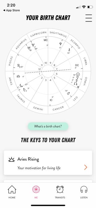

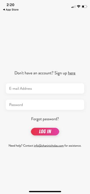
Screenshots of Chani
II. Goals
The goals for the app design were as follows:
1. Simplicity – I wanted to create something easy to navigate, with clean visuals.
2. Easily Sharable – I created the birth chart tab in the app with screenshots specifically in mind. I wanted to have all the chart information on 1 page so it would be extremely easy to take a quick screenshot and share it with friends even without them having to download the app.
3. Both Light and Dark Mode – Two different color palettes so that users can choose which they prefer.
III. Prototyping
My immediate first thought when starting was color palette. I wanted something warm and inviting that would easily work as a gradient. After playing around with a few different combinations I chose the options below:
| #FB6B02 | #FF8A00 | #FFB800 | #FDD400 |
This color combination was what caused me to think of the name “Sun Sign” since the colors reminded me of the sun and the sun sign is a common astrology concept.
While working there were lots of small details that stood out to me as important:

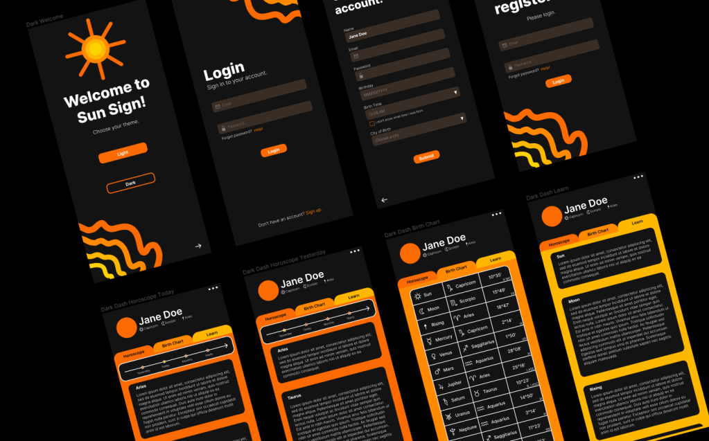
1. Clean icons – I wanted the icons to match the overall theme of the app so I created my own. This was also in part so that I could practice my vector art and graphic design skills. The icons are displayed to the left.
2. Picking the theme first – The user is able to pick the theme they want from the very beginning. Users who may be sensitive to light mode do not have to go through account set up and login with a theme that may hurt or strain their eyes.
3. Checkbox for those who don’t know their birth time – While birth charts are most accurate when the time of birth is known, it is still fairly accurate without it. Not many people know their birth time, but may still want to use the app.
4. Profile that displays your Big 3 – The Big 3 in astrology is your sun, moon, and rising sign. These are the signs that tend to have the most pull on your personality and what are commonly asked for and talked about.
IV. Final Product
After implementing all of the design aspects, I believe I achieved the goals detailed above. All graphics were created by me in Figma. Here are the final results:

The full prototype for a closer look at each page can be found here.
App Studied:
Chani
Design Tool:
Figma
Design Study: Stay Hydrated
Stay Hydrated is a design I made to help practice and get a better hold on Figma. My goal was simplistic UI. I wanted to create something fun and eye catching, but with an easy, user friendly design. The app is designed to track your water intake for the day. View the Figma prototype here.
I. Design Flow
I created a design flow in FigJam to help detail what I was thinking while designing this app. Each component is designed with intentionality. View the design flow in FigJam here.

II. Final Product
There was no real creative process here other than to play around with Figma to grow more familiar with the tool. Here is a closer look at the final design. The font is bubbly and the background is composed of water splashes. It’s a fun and playful design that will hopefully make the user think about water just by looking at it.

The full prototype for a closer look at each page can be found here.
App Studied:
Figma
Design Tool:
Figma
Web Design: Mobile vs. Desktop
Before building the website as it is now, I played around on Figma to create a more colorful and retro style design. I wanted to be able to design UI for both mobile and desktop pages. A closer look can be found on my Dribbble here.

This design ended up being scrapped, but was good practice. If you look at the dividers on this website, I did end up using the daisy chain that I created. I felt that the design was a too loud and distracting, and took away from the actual content of the page.
Design Tool:
Figma
This Website!
Website built by me. 🙂
Design Tool:
WordPress
 cesdesigns